Please turn your device to portrait.
Heimtextil 2026 in Frankfurt presented a design programme centred on material authenticity, earthy colour storytelling and the creative tension between AI-generated aesthetics and handcraft. For Australian retailers, fabricators and specifiers, the trends translate directly. Coastal, bush and urban residential contexts map closely onto the palettes and textures emerging from this year’s show, writes James Boston.
The Design intelligence coming out of Frankfurt
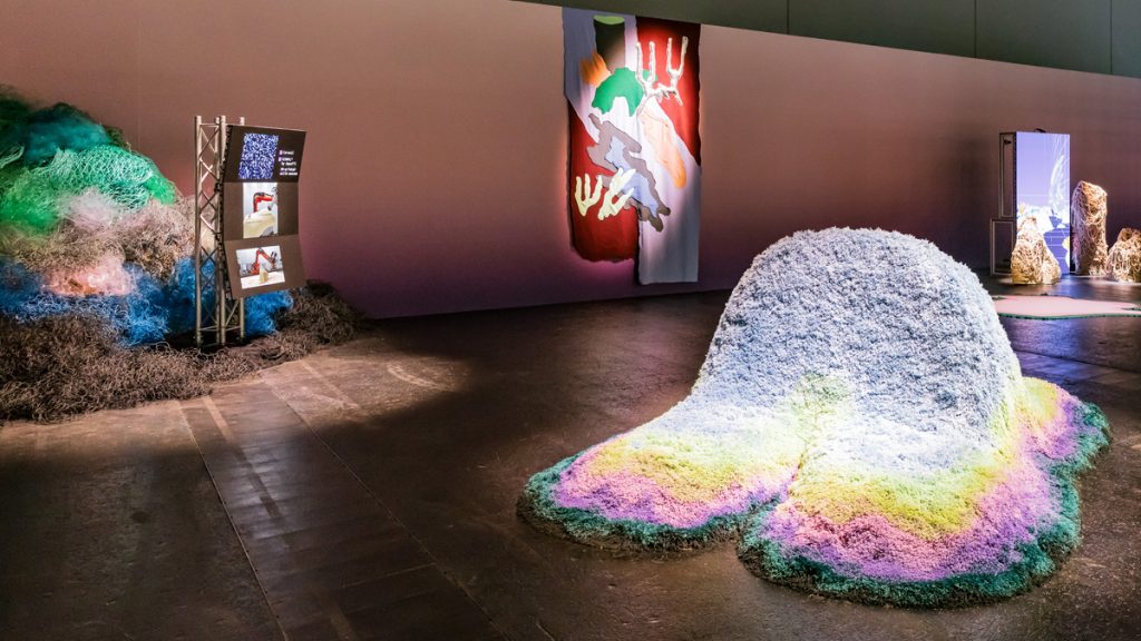
Heimtextil 2026 (48,000 visitors, 3,000 exhibitors across 17 halls in Frankfurt) organised its entire trend programme around a single creative argument: the return to natural materials and tactile craftsmanship as a deliberate counterweight to digital culture. Milan-based collective Alcova curated the “Craft is a Verb” programme, exploring what happens when AI-generated pattern and traditional weave technique appear in the same piece of cloth.
For Australian window furnishings businesses, the design direction is immediately relevant. The colour palettes, material textures and pattern languages emerging from this year’s show align closely with the aesthetic conversations already happening in coastal residential, bush retreat and design-led urban interior briefs. The trend is not arriving from left field. It is arriving to meet client demand that is already forming.
Colour: five palettes, three market contexts
The Heimtextil 2026/27 colour story is structured around three orientations: Naturally Uneven, Radically Restructured and Regenerative. Within those, five specific palettes carry the commercial weight: Revival Mud, Syntropic Forest, Naturally Uneven Green, End of Petrol and Imperfect Pink.
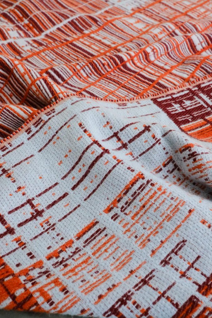
Revival Mud is the standout for Australian application. A warm, dense, earth-anchored tone (neither brown nor terracotta but somewhere between the two), it maps directly onto the palette that has been building through coastal and regional residential interiors for several years. Australian designers working in Queensland, the Northern Rivers and the Western Australian coast have been specifying these tones in soft furnishings, upholstery and drapery already. Revival Mud arriving at Heimtextil scale signals that the palette has moved from a local coastal aesthetic into a global direction. For retailers, that is not a risk. It is confirmation that current stock alignment is correct and the category has legs.
Syntropic Forest occupies the mid-tonal green register (muted, slightly grey-green, referencing Australian bush scrub more than northern hemisphere forest). This tone performs well in Australian interiors with significant glazing because it holds its depth without fighting the natural light flooding in. At full-length drape scale, Syntropic Forest reads as grounded and contemporary rather than decorative.
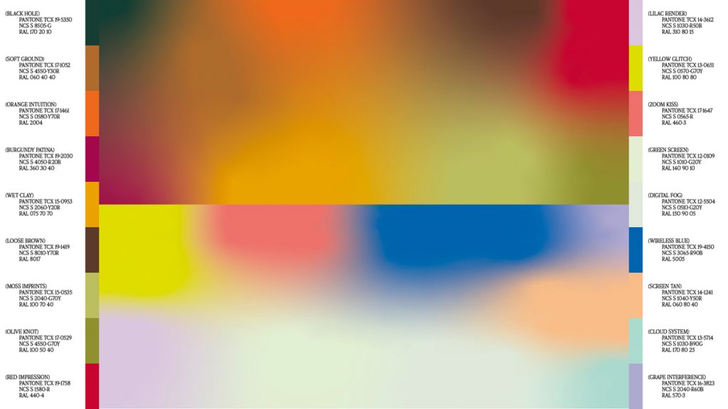
Naturally Uneven Green introduces variation and process into the palette. This is not a flat commercial colour. It is a tone that suggests uneven dyeing, slight batch variation, a material that arrived from somewhere and carries evidence of the journey. In Australian residential specification, particularly in architecturally ambitious projects in Kangaroo Valley, the Mornington Peninsula or the Adelaide Hills, that quality of material narrative has genuine appeal to the client base.
End of Petrol sits at the directional end of the palette (a deep, shifting blue-grey with iridescent undertones that changes register depending on the light source). In Australian interiors with large windows and strong natural light, End of Petrol will read differently at 7am than at 3pm. For the right space, that responsiveness is a selling point. For hospitality and boutique commercial, it offers the kind of considered detail that a design-literate client will appreciate and point out to guests.
Imperfect Pink (warm, dusty, slightly off-register) is the most European-adjacent palette in the group, and requires the most careful translation for Australian application. It has strongest resonance in urban interior contexts: Melbourne terrace renovations, Sydney apartment projects, boutique Adelaide fit-outs where the design language leans considered and contemporary rather than landscape-referential. Positioned correctly, it reads as sophisticated restraint.
For retailers: the Heimtextil colour calendar runs approximately 18 months ahead of Australian retail uptake. Businesses building their 2026 fabric assortments now should be auditing current stock against these five orientations and identifying gaps. The earth and mid-natural register (Revival Mud, Syntropic Forest, Naturally Uneven Green) represents demand that already exists in premium residential and is about to hit volume.
Natural fibres: Design materials first
Hemp, jute, flax (linen) and nettle moved to the centre of Heimtextil’s material story not as sustainability statements but as design materials with specific aesthetic properties. The craftsmanship emphasis (traditional weaving, visible texture, artisanal finishing) is what drives their market appeal. Understanding what each fibre actually does visually and tactilely is what allows retailers and fabricators to sell them with confidence.
Hemp presents with a pronounced, irregular weave structure. The visual texture is obvious from distance. This is not a smooth, receding fabric but a surface with character that pulls focus and holds interest. In window treatments where the fabric itself is the design statement (unlined roman blinds, flowing drapes in a room with architectural bones), hemp earns its premium position. The hand is firm without being stiff, with a satisfying weight that drapes well in larger panel formats.
Jute sits in similar territory but with more golden warmth in the base tone. Untreated or minimally processed, jute reads as genuinely artisanal. There is no mistaking it for a synthetic attempting natural. For coastal and regional applications where the interior design language references landscape and material honesty, jute carries that narrative without effort.
Linen (flax) is the most commercially versatile of the group. It spans the range from fine, almost translucent weaves through to substantial textured cloth. Linen’s behaviour in Australian light conditions is distinctive: it softens and diffuses strong sunlight in a way that synthetic sheers can approximate but rarely match. The slight irregularity of natural flax (slubs, variation in weft density) becomes more visible as light passes through, which in window applications is precisely the right place for that quality to emerge.
Nettle is the emerging specification fibre for design-forward applications. Finer than hemp, with a slight lustre that sets it apart from the rougher naturals, nettle works in contexts where a more refined hand is needed without sacrificing the natural material narrative. It is the fibre for the specifier who wants natural but cannot compromise on surface quality.
In Australian light conditions – which are more intense and less diffuse than in northern Europe – natural fibre window treatments behave differently than their European showroom presentations suggest. The strong directional light that defines Australian interiors amplifies texture: weave structure and surface variation that reads as subtle in a Frankfurt exhibition hall reads as rich and pronounced when morning sun hits it at 15 degrees through a north-facing window. For retailers, that is a merchandising insight as much as a product fact. Natural fibre samples shown in good direct light will sell themselves.
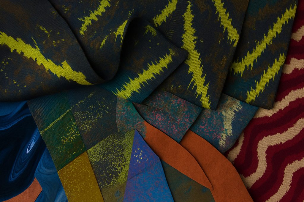
Pattern and texture: What reads at scale
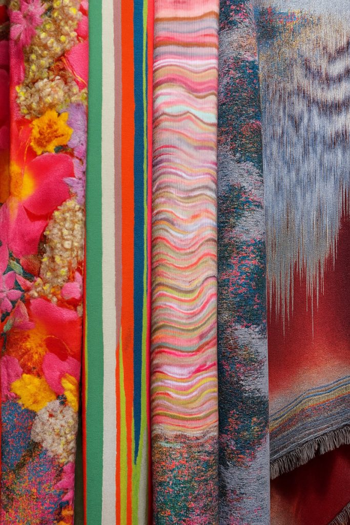
The Heimtextil pattern direction splits along a macro/micro axis. At the macro level: organic, botanical and landscape-referencing prints in which the natural world appears as motif. At the micro level: woven-in surface texture (slubs, nodules, irregular weave structures) that creates visual interest without any applied print. These are not competing directions; they serve different applications and different client conversations.
Australian residential context strongly favours the micro direction. The country’s glazing norm (large windows, often floor-to-ceiling, frequently on multiple elevations) means window treatments operate at genuine architectural scale. A pattern that reads beautifully on a 30cm swatch will disappear at 2.4 metres and re-emerge as noise at 3 metres. Woven-in texture, by contrast, performs at every scale: engaging in close inspection and resolving into a rich, unified surface from across the room.
For the botanical and organic print direction, the Australian market context favours restraint in scale and tone. Large-scale botanical prints can work in statement applications (a single wide panel in a double-height living space, or the back wall of a boutique hotel lobby) but require design confidence in both the specifier and the client to carry. Smaller-scale organic motifs in the Syntropic Forest palette register have broader application and less visual risk.
Showroom merchandising implications are direct. If the tactile authenticity story is real (and Heimtextil’s consistent emphasis on it suggests it is), then sample presentation needs to reflect that. Fabric swatches displayed flat and handled briefly tell one story. Samples that drape, that pool, that catch light from an angle, that customers can press between their fingers and understand the weight of, tell the design story the materials are built to deliver.
The Crafted Irregularity sub-trend within “Craft is a Verb” reinforces this. Fabrics featuring visible seams, irregular dyeing, asymmetrical finishes and surface variation are positioned as a deliberate counter to algorithmic perfection. For showrooms, that means displaying these materials in ways that celebrate their variation rather than standardising presentation as if they were commercial synthetics. The irregularity is the point. Sell it as intentional luxury, not apologise for it as inconsistency.
AI AND CRAFT: THE VISIBLE CO-WORK AESTHETIC
Olaf Schmidt, Vice President Textiles and Textile Technologies at Messe Frankfurt, was direct at Heimtextil 2026. “Our aim is to make these concrete applications tangible and actionable for the industry,” Schmidt says, describing the “Texpertise Focus AI” programme (an exhibition designed to show AI not as a future concept but as a current production tool).
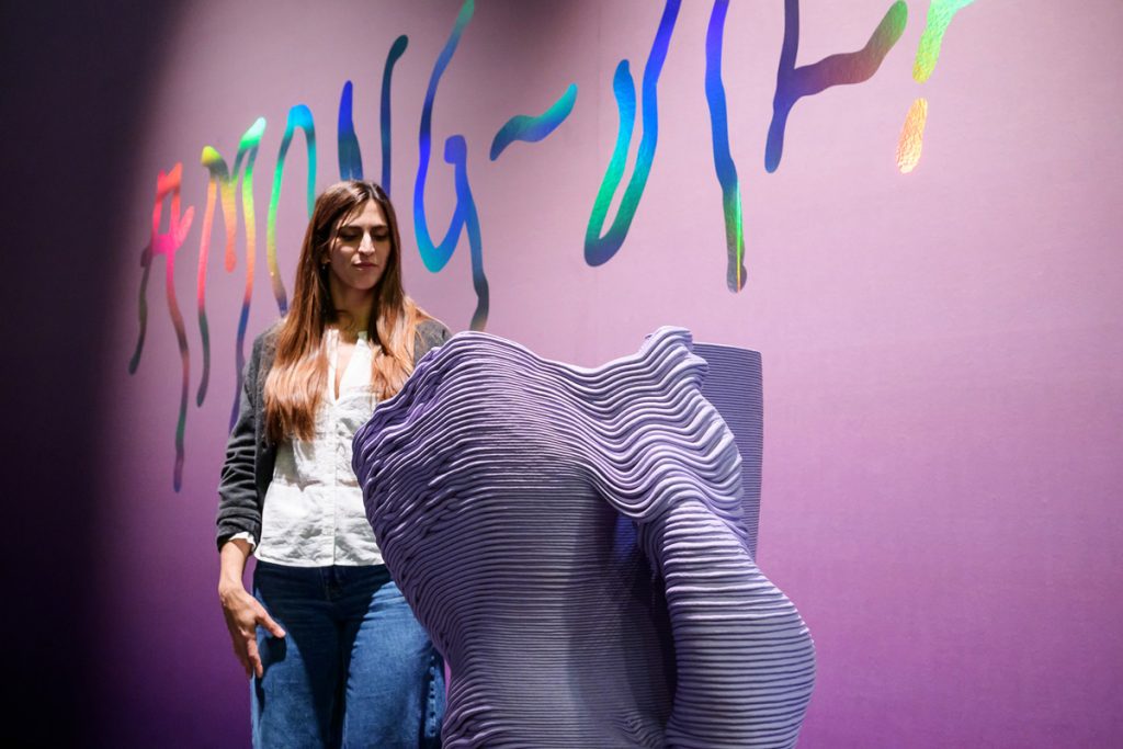
The “Craft is a Verb” trend direction introduced the term “Visible Co-work” to describe the aesthetic emerging when AI-generated elements and handcraft appear together in a finished textile. The Re:Media sub-trend captures the design vocabulary most clearly: hand drawings layered with digital renderings, jacquards incorporating glitch motifs, embroideries where pixelated gradients meet traditional stitch. These are not accidentally hybrid aesthetics. They are intentional design positions where the tension between precision and imperfection is the point.
In Australian residential and hospitality contexts, the Visible Co-work aesthetic has a clear target market. High-end residential clients in the design-literate segment (the same clients specifying natural fibres and earthy palettes) are receptive to materials that carry a conceptual story. A panel fabric that openly declares its AI-assisted pattern generation, finished by hand and woven on traditional equipment, speaks to authenticity and craft in a way that neither pure digital output nor pure handcraft can achieve alone. The contradiction is the value.
For fabricators, the practical application of AI tools is already commercially viable. Pattern generation and colourway development (historically expensive and time-consuming for small-volume custom work) have been transformed by accessible AI design tools. A fabricator who can offer a specifier 20 colourway variations for a jacquard panel within two to three days, rather than the four-week traditional sampling process, holds a competitive position that changes the custom specification conversation. That capability is not theoretical. It is available at small-business scale now.
Patricia Urquiola’s “among-all” installation at Heimtextil 2026 illustrated the premium end of this direction: textiles conceived as responsive, contextually aware design objects rather than passive surface treatments. For Australian hospitality specification (boutique hotels, restaurant fit-outs, members clubs where the design brief includes material storytelling), the Visible Co-work aesthetic offers a language that distinguishes a space without relying on conventional luxury signifiers.
The glitch and pixelated gradient motifs from the Re:Media direction will read best in urban contexts where design culture is already engaged with the visual language of digital experience. Melbourne’s inner suburbs, Sydney’s emerging commercial precincts, Brisbane’s growing hospitality scene: these are the markets where the AI-craft aesthetic has immediate traction. Regional and coastal residential will follow, but on a longer timeline.
Australian Market Fit: What works here, what waits
The Heimtextil trend calendar runs approximately 18 months ahead of Australian volume retail uptake. But that lag is uneven. Premium specification moves faster, volume residential moves slower, and the Australian design culture applies its own filter regardless of timing.
What translates directly
The earthy, muted palette (Revival Mud, Syntropic Forest, Naturally Uneven Green) is already present in premium Australian residential specification. This is not a European trend arriving into unfamiliar territory; it is the global trade fair catching up with a direction that Australian coastal and bush interior design has been developing organically for several years. Retailers with current stock in these tones are ahead, not behind.
Natural fibre window treatments in linen and hemp have established traction at the premium specification end. Architects and interior designers working at the top of the market have been requesting these materials for several years. The Heimtextil signal confirms volume uptake is coming: within 12 to 18 months, what is currently a premium specification material will be entering mainstream retail enquiry.
The AI-assisted design capability applies immediately for custom fabrication work. Specifiers working on bespoke residential and hospitality projects want options, speed and colour flexibility. Fabricators who have built AI-assisted design workflows into their process can offer all three.
What requires translation
End of Petrol and Imperfect Pink need contextual interpretation. Neither is alien to Australian design culture, but both require placement: End of Petrol in architecturally ambitious spaces with considered lighting; Imperfect Pink in the urban interior contexts where a European-influenced design language is already established. Deployed without context, both palettes can read as directional in ways that close down rather than open up client conversations.
The Visible Co-work aesthetic (glitch motifs, pixelated gradients, AI-human hybrid designs) has a clear Australian market, but it is concentrated. Design-forward urban residential and boutique commercial are the right initial contexts. Volume residential is not yet there, and regional applications are at least two to three seasons away.
Large-scale botanical prints require restraint in Australian application. The glazing scale of contemporary Australian architecture means pattern at print scale needs design confidence that not every client brief supports. The woven texture direction (micro surface interest rather than macro motif) carries fewer specification risks and has wider application across market segments.
THE TIMELINE FOR RETAILERS AND FABRICATORS
Premium specification: Now. The clients and specifiers who drive the leading edge of Australian residential and hospitality design are already engaged with this direction. Natural fibres in the Heimtextil palette range, presented with design authority and backed by tactile showroom merchandising, will find buyers at the premium end immediately.
Volume residential: 12 to 18 months. The trend will reach mainstream retail consumer awareness through the design media cycle and filter into standard enquiry. Retailers who have built natural fibre and earthy palette ranges into their core assortments by mid-2026 will be positioned when that demand arrives. Those building assortments in late 2027 will be catching up.
Heimtextil is most valuable as a forward signal, not a retrospective report. Businesses that read the Frankfurt direction now and make product and positioning decisions against it (not waiting for demand to appear before responding) will hold the market position when the curve peaks.